Tuesday, April 24, 2012

Juan Genoves

This Spanish artist (b. 1930- ) creates paintings as a way to interpret memories and events in his past- and the political events that shaped Spain.
Images of individuals and groups of people show up in his work. The viewer sees them as small figures, far away and below eye level. Upon close inspection his paintings transform from photographic images into abstract paintings with texture and thick paint.
Be sure to visit his website to view the videos about his work.

Here is the link @ http://www.juangenoves.com/en/


Wednesday, April 4, 2012

Monet Effect Is Up!

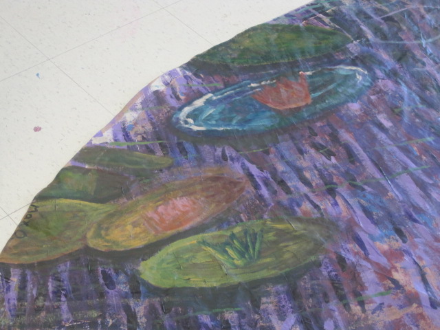
Today we completed the "Monet Effect Operation" and stapled the painting to the ceiling in the Academy Foyer. 

Thanks to teamwork, the operation went smoothly.


Tuesday, April 3, 2012

Alexi Cournoyer's: I Learned that in Monea's paintings you don't have to be as neat with your work.

Olivia's

In this art project our class was asked to recreate a piece of Monet's paintings. His choice of color and the way he applied the paint was the start of impressionism. In my pieces that I added to the painting I used similar colors as Monet and always the way he applied his paints. The shadow under the water lilies, shown above, is also shown in his work. It also shows the appearance of water. I learned that the way he applied his paint was a huge component in the way he achieved his works. 

Mikayla's Painting

The paintings that I did looked very similar in color to Monet's. I used a lot of crimsons and greens to match the color of the water around the lily pads. The brush strokes I made were very loose and dry which gives a shimmering affect similar to some of Monet's works.

Max O'Neill

For this painting I had to really change my personal style of painting. I always thought that paintings had to be very crisp and clean, but Monets' style is super loose and really somewhat sloppy. Our class had to work together by blending different colors and tones to create a scene of a pond filled with Lilly pads. I interpreted Monets' oval shaped brush strokes and tried to use shadows underneath the Lilly pads to create  a more 3D view to help them pop.  Also, I tried to match the warmer colors of the background to the color of the Lilly pad. To do so, I used the colors brown, green, yellow, and blue.

Alaina's Monet

My works of art show the style of Monet through the colors and brush strokes. By using the dark mix of Veridian Green and Cadmium Reds I was able to create an intense dark green similar to the shades that Monet used. By making dragging marks next to other shades of green I was able to create a water effect, and depth.